
Keep your customers by your side

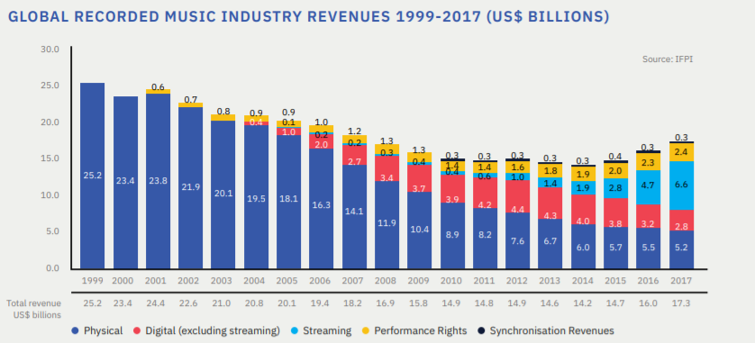
In April 2019, the International Federation of the Phonographic Industry (IFPI1) have published their annual report2 in which they shared some key figures about music market:
- global recorded music market grew by 9.7% in 2018, the fourth consecutive year of growth
- total revenues for 2018 were US$19.1 billion
- streaming revenue grew by 34% and accounted for almost half of global revenue, driven by a 32.9% increase in paid subscription streaming
- there were 255 million users of paid streaming services at the end of 2018
“Music streaming is now bigger than ever, with billions of dollars going into the music streaming industry every year. Most music fans are now using subscription-based streaming services such as Spotify, Pandora, and Apple Music[…]. The stats are pouring in faster than ever for music streaming, showing that this is an industry that has earned a bit more attention.” (source).
This is real. This is NOW. And this is even more true in emerging markets: “In Asia-Pacific region, music industry revenues approached $450 million in 2014 and are expected to reach beyond $2 billion by 2020.” (source).

When talking about digital music service the user can get lost very quickly as the number of apps is plethoric. To name, but a few: Amazon Music, Apple Music, Google Play Music, Spotify, Deezer, Napster, Pandora…
The problem?
People can decide to leave whenever they want so the service has to be really attractive and efficient, app must be resilient, available, easy to use and recommender system must satisfy both the relevance of the proposals and the right dose of diversity.
Why is it important?
Because loosing a customer/user is very costly: of course the company looses the Monthly Recurring Revenue (MRR) but not only.
As explained in this post,
“there is also potential for loss of renewal income or upsell deals[…]. The probability of upselling to an existing customer is around 65%, compared to the probability to selling
to a new prospect which is only around 13%.”.
More than that, “when churn occurs, not only does the marketing team have to dedicate time and resources to bringing in new leads and prospective customers, but now they
have to refocus their attention to re-attract customers that have been lost.”
So in the end we need to add to churn costs the customer acquisition cost (a.k.a CAC). And sometimes, depending on the business domain, this can be really expensive.
In this post I propose you to explore data from a fictional digital music service company and build algorithms that will help them to detect user churn.
NOTE: Everything that follows is based on personal work done as part of one project done during my self-training via Udacity DataScience nanodegree.
The comments, interpretations and conclusions are therefore my own ones and are my sole responsibility. This work should therefore not be considered for anything other than their learning value.
ACKNOWLEDGEMENT: data come from Udacity. I would like to thank them for providing us with data that reflects so much of real life.
Let’s get this party started!
In this project our goal is to predict user churn. We work for a fictitious company called “Sparkify”, a digital music service similar to famous Spotify or Deezer.
Business use case
“Many of the users stream their favourite songs with our “Sparkify” service every day using either the free tier that places advertisements
between the songs or using the premium subscription model where they stream music as free but pay a monthly flat rate.
Users can upgrade, downgrade or cancel their service at any time so it is crucial to make sure our users love our service.”

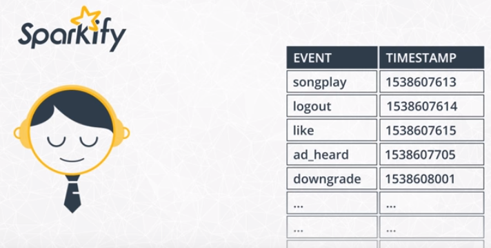
“Every time a user interacts with the service while they are playing songs, logging out, liking a song with a thumbs up, hearing an ad
or downgrading their service it generates data.
All this data contains the key insights for keeping our users happy and helping our business thrive.”
Our job in the data team is to predict which user are at risk to churn, either downgrading from premium to free tier or cancelling their service altogether.
If we can accurately identify these users before they leave, business teams can offers them discounts and incentives potentially saving our business millions in revenue
(this text has been taken from the video of introduction of this project within Udacity’s course).
1. About the data we have at our disposal
We are provided 2 datasets in JSON format:
- a "tiny" one (128MB although)
- a full dataset (12GB)
To use the full dataset one has to build a Spark cluster on the cloud (AWS, IBM, whatever).
1.1. Global overview
In the dataset, we have 18 features:
root
 |-- artist: string (nullable = true)
 |-- auth: string (nullable = true)
 |-- firstName: string (nullable = true)
 |-- gender: string (nullable = true)
 |-- itemInSession: long (nullable = true)
 |-- lastName: string (nullable = true)
 |-- length: double (nullable = true)
 |-- level: string (nullable = true)
 |-- location: string (nullable = true)
 |-- method: string (nullable = true)
 |-- page: string (nullable = true)
 |-- registration: long (nullable = true)
 |-- sessionId: long (nullable = true)
 |-- song: string (nullable = true)
 |-- status: long (nullable = true)
 |-- ts: long (nullable = true)
 |-- userAgent: string (nullable = true)
 |-- userId: string (nullable = true)
Each feature has been analyzed one by one (number of missing values, number of different values, etc). Here is the table corresponding to the Data Understanding phase:
| Column name | Type | Data Definition |
|---|---|---|
artist |
Categorical | Name of the artist the user is currently listening to |
auth |
Categorical | Login status of the user (‘Logged In’, ‘Logged Out’, ‘Cancelled’, ‘Guest’) |
firstName |
Categorical | First name of the user |
lastName |
Categorical | Last name of the user |
gender |
Categorical | Gender of the user |
itemInSession |
Numerical | Number of elements played in the same session |
length |
Numerical | Number of seconds of the song listened by user |
level |
Categorical | Free or paid user? |
location |
Categorical | User’s location (in United States) |
method |
Categorical | HTTP method used for the action (PUT or GET), this is a technical information |
page |
Categorical | User’s action (one event corresponding to what used did: listening a song, an ad, logging, downgrading, etc) |
registration |
Numerical | User’s registration timestamp |
sessionId |
Numerical | Session id |
song |
Categorical | Song currently played by user |
status |
Numerical | HTTP code for user’s action (200=OK, 404=error) |
ts |
Numerical | User’s action timestamp |
userAgent |
Categorical | User’s browser user-agent |
userId |
Numerical | User technical id |
1.2. What can we use to determine when user will churn?
Each row in the dataset corresponds to a specific event for a specific user. So for each user we have one to many events that describe his behaviour among time. Our goal will be to learn from this behaviour in order to detect user that might soon churn.
NOTE on Big Data: in the smaller dataset there are 278154 events corresponding to 225 unique users. This dataset has been used to explore the data and build/debug the Feature Engineering script.
This script has then been used within a Spark cluster deployed on AWS cloud (EMR)34.
The graphs below come from the full dataset that contains more than 26 million events corresponding to 22278 unique users.
Gender vs. churn
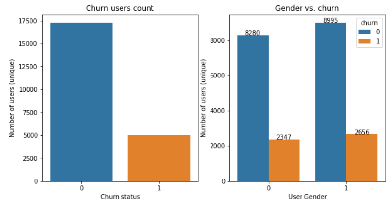
First observation is that (fortunately for Sparkify!) there are more users that stay than users who churn. This will be an issue to deal with during the Modeling phase and it will be discussed later.
From what we can see within this dataset there is no real evidence that Men (gender=1 in the graph) churn more than Women (22.8% of Men have churned while 22% of Women have churned, we can say that it is more or less the same).
Subscription level vs. churn
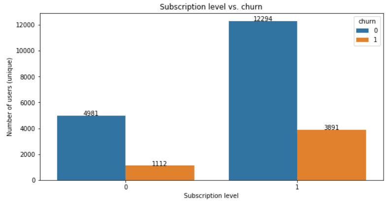
Are the users with a paid subscription level (level=1 in the graph) more willing to leave or not?
There are more users with a paid subscription account than free tier so here again we have to be very careful when making conclusions.
Figures tell us that 24% of people with a paid subscription have churned versus “only” 18% for people with a free account who have churned.
Registration time vs. churn
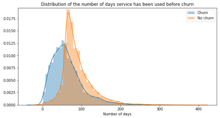
We have seen that the column registration refers to the date the user registered to the service, we can analyze for how long did the user tried the service before cancelling.
In this dataset, churn users have less used the service. Building a feature with the time elapsed (such as number of days for example) since the registration could be something useful in the modeling part.
Once this is said, we must remain very cautious about that because of course, as soon as the user stops using the service this value stops increasing (and that might explain why it is less for churn users).
User engagement vs. churn
The idea developped here is that the more a user interacted with the service (for example in terms of number of artists/songs listened, number of sessions, time spent listening) the more chances we have this user enjoys the service and then will not quit. Let’s see if there are big differences between churn users and the others.
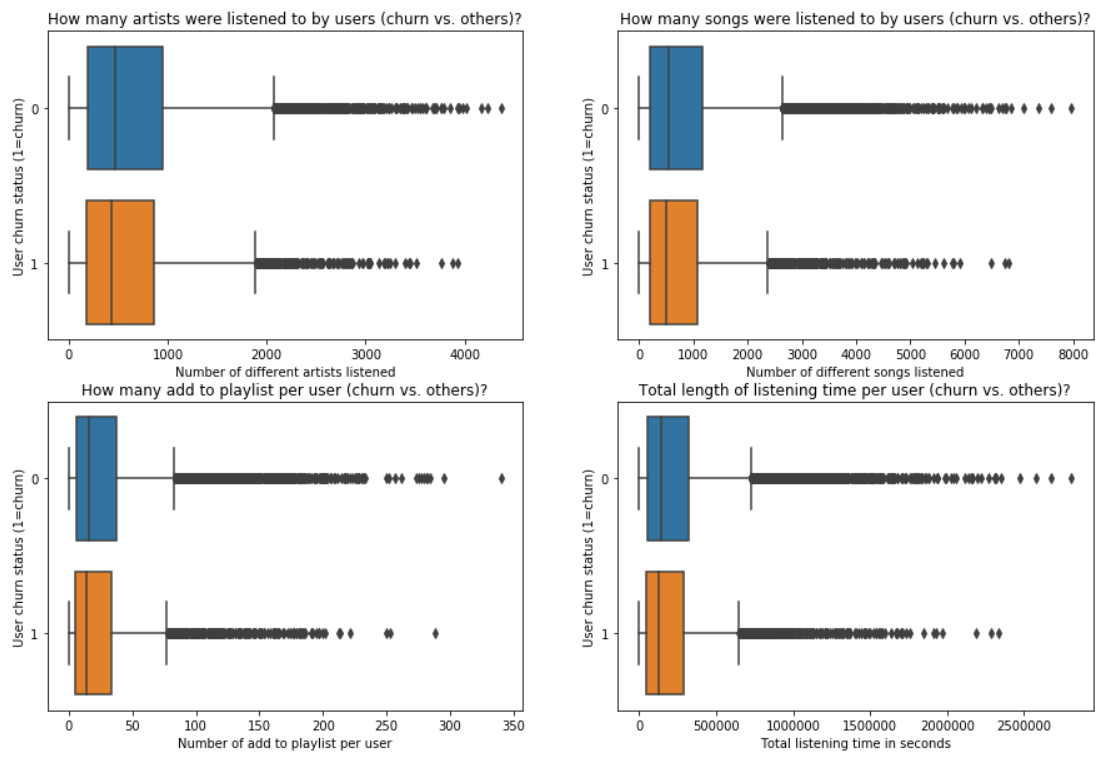
Observations:
- churn users have listened to less unique artists and songs. It can means that they are less connected with the service but those figures can also be explained because churn users have stopped using the service so the "counter" has stopped as well
- the total time of listening is also lower for churn users (explained by the previous measures: less connections, less songs listened = less total time)
User social interactions vs. churn
This section is quite similar to the previous one: here we will focus on “social interactions” for a user. It could be for example: how many friends did the user add? How many Thumbs up or Thumbs down? Could it be a clue to detect incoming churn?
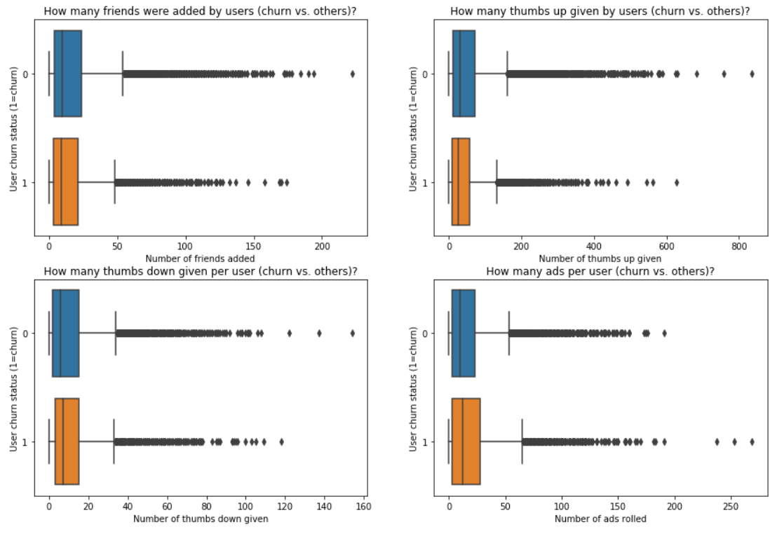
Observations:
- As imagined, there were less "positive social interactions" (add a friend, give a like) with the app for churn users.
- On the other side, the distribution for "negative social interactions" (dislike/thumbs down) are quite close from each other. That could mean that the recommendations (for example) were not so good and the user gave a thumbs down.
- The last one has to be taken with caution because users with a "paid" subscription are listening less (and even no) ads. Though, we can observe that churn users have rolled ads more than the others. Perhaps they cancelled due to the amount of ads.
Upgrade/Downgrade vs. churn
While having a look at the different pages, I noticed 2 kind of pages that could be interesting ones: Upgrade and Downgrade. Intuition here is to say that if user has upgraded the service he is now more engaged whereas, on the other side, the “downgrade” step could be the first step towards the churn.
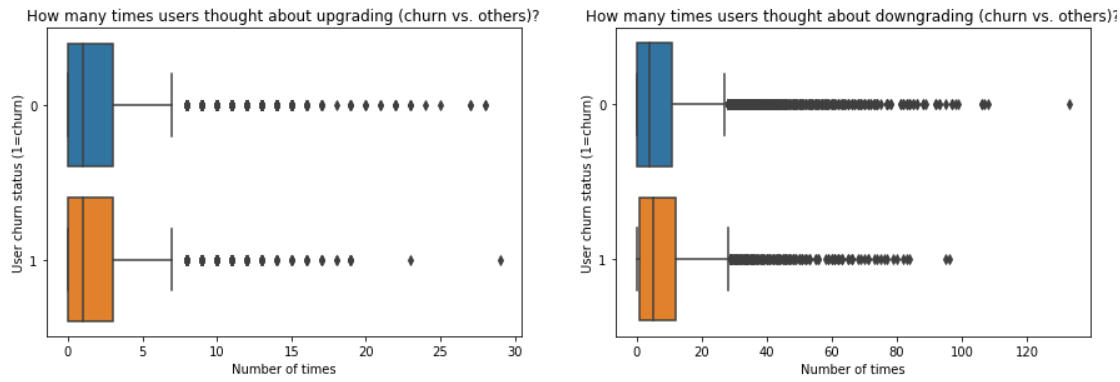
Observation: the most interesting thing here is that churn users thought more about downgrading (even if most of them stayed in the end). This could be the first step towards the cancellation.
User's Operating System vs. churn
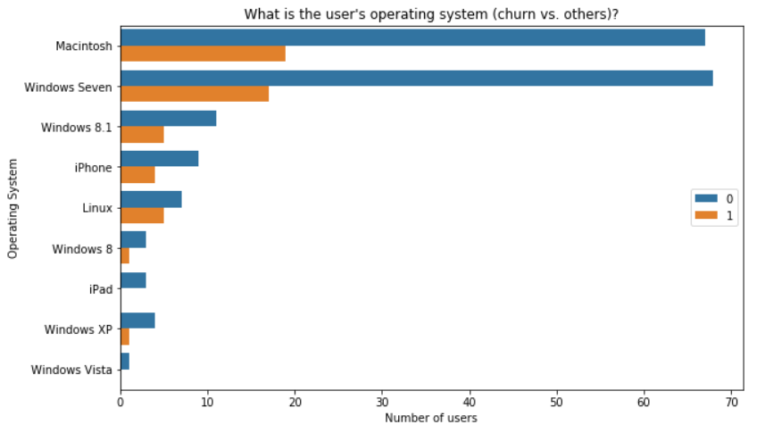
There is a feature with user’s browser user-agent. We could try to extract some information such as the underlying Operating System or even maybe the device.
Process: a regular expression has been used to retrieve Operating System information from the user-agent value5. Then, values were mapped to most known OS by using this table6.
Observation: in this smaller dataset people with a Mac are the ones who have churned most (but they are also the most represented users!). I would highliht ‘Linux’ users that are near 40/60% of churn/no churn! Maybe there is an issue with the browser they are using or something that does not work as expected.
2. Collect everything we need
A Feature Engineering phase has been ran against the full dataset in order to collect values per user for each of the element seen during the Data Exploration phase.
After this step the dataset that will be used for Modeling looks like this:
root
 |-- churn: integer (nullable = true)
 |-- gender: integer (nullable = true)
 |-- level: integer (nullable = true)
 |-- timedelta: integer (nullable = true)
 |-- nb_unique_songs: integer (nullable = true)
 |-- nb_total_songs: integer (nullable = true)
 |-- nb_unique_artists: integer (nullable = true)
 |-- total_length: double (nullable = true)
 |-- total_add_playlist: integer (nullable = true)
 |-- total_add_friend: integer (nullable = true)
 |-- total_thumbs_up: integer (nullable = true)
 |-- total_thumbs_down: integer (nullable = true)
 |-- total_ads: integer (nullable = true)
 |-- think_upgrade: integer (nullable = true)
 |-- has_upgraded: integer (nullable = true)
 |-- think_downgrade: integer (nullable = true)
 |-- has_downgraded: integer (nullable = true)
 |-- nb_404: integer (nullable = true)
 |-- Windows 8: integer (nullable = true)
 |-- iPad: integer (nullable = true)
 |-- iPhone: integer (nullable = true)
 |-- Macintosh: integer (nullable = true)
 |-- Linux: integer (nullable = true)
 |-- Unknown: integer (nullable = true)
 |-- Windows Vista: integer (nullable = true)
 |-- Windows 81: integer (nullable = true)
 |-- Windows XP: integer (nullable = true)
 |-- Windows Seven: integer (nullable = true)
Results of the Feature Engineering process
As you can see, a lot of features have been extracted. In few words, we have:- the churn column (our target which is binary 0/1). A user has been classified as churn as soon as he submitted cancellation (this is one specific event that can be caught in the list of given events).
- user's informations such as his gender, his subscription level, time elapsed between his registration and his last known action (timedelta)
- user's usage of the service (nb_unique_songs, nb_total_songs, total_length) or his social interactions (total_add_friend, total_thumbs_up)
- informations about how many times the user thought about upgrading or downgrading and how many times he actually did
- user's operating system extracted from his user-agent which could help us to identify users of a version that does not give entire satisfaction
- number of errors encountered which could help us to identify users who had several issues and then maybe quit
In the end there are more features than in the original dataset (also due to the fact that some categorical features have been one-hot encoded in order to be passed to our models which accept only numeric values).
But there are far less rows as now we have only one row per user (so 22178 unique users overall).
3. Modeling: now it’s time to try to predict the churn!

3.1. What kind of problem is it and how can we evaluate our performance?

Here our goal is to predict the churn, which is a qualitative value so it is a classification problem.
As already said earlier when looking at the graphs, there are more users that stay than users who churn. So our target class is imbalanced. This is an issue in Machine Learning because we have less examples to learn well and if our model
often see the same value it will obviously ‘learn’ that and tend to predict this value.
That is why we have to wisely choose the performance metric!
3.2. So what will be our performance metric?
If we choose accuracy as the performance metric to check whether we classify well or not, a dummy classifier that always predict the most frequent class will have a good score but in the end we will have built a very poor model.
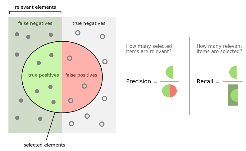
In classification problems, when data are imbalanced we prefer using other metrics such as:
- Precision: among all the positive predictions made by the model, we count how many of them were actually positive. This is a ratio and the higher the better because it means that our model is very precise. In other words, when the model says it is true, it is actually true (in this case there are few “False Positives”).
- Recall: among all the real positive values, how many of them did our model classified as positive? This metric indicates how good is our model to “catch them all”. Indeed, the model can be very precise but could still miss a lot of positive samples. And this is not good neither. Recall is also a ratio and the higher the better (when it is high there are few “False Negatives”).
Precision has to be chosen when there is a big impact with False Positives.
Recall has to be chosen when there is a big impact with False Negatives.
That is why, depending on the use case, we might want to focus on Recall rather than Precision or vice-versa:
For example in medical domain, when algorithm says the person has/does not have cancer, we want this information to be as accurate as possible (you can easily imagine the impacts when this is wrong), this is the Precision.
But we also want to avoid saying someone that he does not have cancer whereas he actually has one (this is the worst case scenario).
So perhaps in this case we want to focus more on Recall (ensure we catch all of them) even if it means that it is less precise (people will pass other tests that will later confirm that in the end they do not have cancer).
If we do not want to choose between Precision or Recall because both are kind of equally important we can choose to use the F1-Score metric which is the harmonic mean of both:
F1 score = 2x ((Precision x Recall)/(Precision + Recall))
F1-Score will be the selected metric in our case.
3.3. Ensure that we have enough data to train on
When data are imbalanced there is also another issue: how to ensure that in our training dataset we will have enough samples of each class to train on and then be able to learn and classify correctly?
The split between train and test dataset cannot then be totally random. When working with scikit-learn models, there is this scikit-multilearn package
that can help to stratify the data.
We can also use other techniques such as:
- oversampling: duplicate the data for classes that appears less so that in the end there are more of them and algorithm can learn. The drawback is that depending on the use case, as it is the same data that is duplicated, the learning can have a big bias.
- undersampling: randomly remove some occurrences of classes that appears the most. This is also a good idea but it can lead us to a lot of data loss depending on how huge is the gap between classes.
- we could mix both oversampling and undersampling
As we are working with Spark ML, this is not possible to use this scikit-multilearn package out-of-the-box so easily. Fortunately, in our case there is a single class and it is binary (0/1), the random split between training and test datasets gave good results:
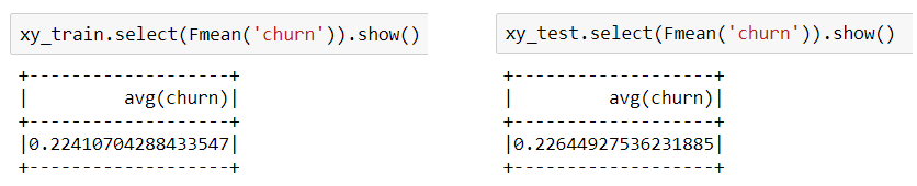
We can see that there are more or less no difference in the churn rate between those 2 datasets so they are well balanced.
3.4. Eligible models
Actually I will not pick one model randomly but instead I will try a few:
- 2 dummy classifiers that will return as predicted value always 0 or always 1
- another very simple statistic model: a Logistic Regression (it will be our reference model to compare to)
- an ensembling model based on trees such as Random Forest
- a more complex model (but yet still based on trees) named Gradient-Boosted Tree.
All those models are part of the Spark ML7 so we can use them.
Why those models?
- Dummy classifiers
- Motivation for those models is to compare more complex models with something very simple that does not even require machine learning and see how much we do better (or not…). We can measure the
performance metric for those classifiers and see the impact on
accuracymetric when class is imbalanced and have a first overview of what is the F1-Score for both of them.
- Logistic Regression
- It is a very basic model but which sometimes give good results and could be an outsider due to the computation time which is not very high.
- Random Forest
- The cool thing with trees is that it is possible to plot them, so explain them. Random Forest are also known to perform pretty well even when classes are imbalanced. Moreover, in terms of preprocessing there are few things to do because we do not even have to scale or normalize or data, we jut have to ensure that there are no missing values.
- Gradient-Boosted Tree
- It is also based on trees and is a powerful machine learning technique that uses Boosting approach: trees are added over iterations in order to reduce the errors made by the combination of all the previous ones.
3.5. Model results and confusion matrix
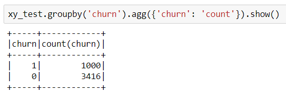
For a better understanding, after the split here are the count of churn vs. no churn users in the test dataset.
Modeling started by building a pessimistic classifier that predicts each user as a churn one and an optimistic one that predicts that all users will stay (so no churn at all). Here are the scores for both of them:
- F1-Score for pessimistic classifier: 0.08 (accuracy: 0.23)
- F1-Score for optimistic classifier: 0.67 (accuracy: 0.77)
As we can see, it is quite easy to have 77% of accuracy with a dumb classifier so accuracy is definitely not the right metric to take.
Below is a report of the metrics results for each model. We can see that with the default parameters the Gradient-Boosted Tree was our best model with a F1-Score=0.82. Even if it
is the algorithm that takes much more time to run (due to the sequence of tree addition), we can afford it because the performance is very high compared to others solutions that have been tried.
This model has been chosen for a further tuning phase in which a range of possible values are explored for some parameters of the model. There were:
- stepSize (a.k.a. learning rate)
- maxDepth: to control the maximum depth of the tree
- minInstancesPerNode: the minimum number of instances each child must have after split.
- subsamplingRate: fraction of the training data used for learning each decision tree
| Model name | Computation time | F1-Score | Weighted Precision | Weighted Recall |
|---|---|---|---|---|
| Logistic Regression | 23.6s | 0.75 | 0.78 | 0.8 |
| Random Forest | 17.2s | 0.79 | 0.82 | 0.82 |
| Gradient-Boosted Tree | 1min 1s | 0.82 | 0.83 | 0.84 |
| Tuned Gradient-Boosted Tree | 24min 48s | 0.82 | 0.83 | 0.84 |
But in the end, the best model found by the grid search was not better than our initial one. And there is something painful with the Spark ML package that does not retain all models but keep only the best. So we are not able to have a look at all combinations to adapt our parameters exploration ranges like what we often do when dealing with scikit-learn (source: “you simply cannot get parameters for all models because CrossValidator retains only the best model. These classes are designed for semi-automated model selection not exploration or experiments.”)
Here is the confusion matrix for this GBT classifier:
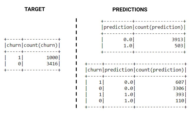
Those results are the best ones but when having a deeper look it is not so amazing, we were able to catch only 40% of the churn users. Good point is that only 3% of the non churn users were classified as churn.
3.6. Features importance
As we are using a tree-based solution we can plot a graph with the features importance: it will then gives us more information about what, in the dataset, contributed the most to the churn prediction.
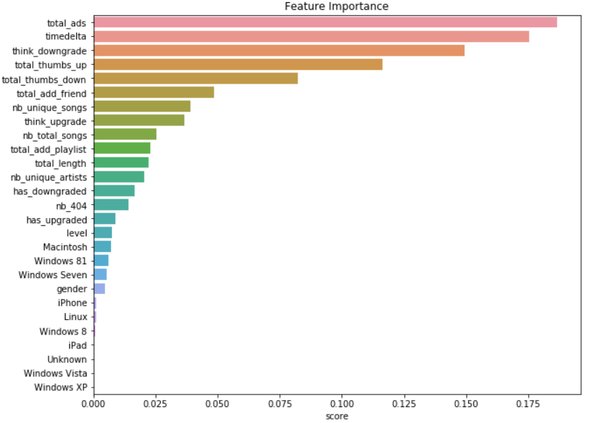
Observations:
In this dataset and with the features I have created:- the one that contributes the most to determine if a user will churn or not is the total number of ads listened. That would mean that users are fed up with ads and decide to quit.
- The second one is the number of days of the service (probably the less you use the more you might churn - we have seen that during the exploration phase)
- Just after comes the social interactions with the service (either thumbs up or down) meaning that you are satisfied or not with the songs that are suggested by the service for example.
- On the other side, we can see that the user's operating system has few importance. As it was quite painful to collect I suggest that we get rid of that information as a further improvement of this model. The data collect pipeline would be much more faster.
WRAP-UP
- We now have a model that can detect churn users with a quite good performance (F1-Score is 0.82 with good precision and recall).
- We could use this model on the whole database of users, classify them and give the list of users that might soon churn to a commercial/marketing service that can contact them and propose incentives for them to stay.
- We also have a better intuition of what contributes the most to churn detection (keep in mind though that this is totally dependent on features that have been created).
Churn prediction gave first encouraging results which still need to be improved through further investigations:
- build new features and/or try to remove ones that could bring more noise than useful information in the model
- 40% of churn users detected is better than nothing but obviously when we are talking about so much money it is not enough and we should invest more energy in finding why others are not well classified (starting with an error analysis phase for instance).
- in our model the churn is only based on people who cancel their service but we could also try to classify people that downgrade from paid-subscription level to free tier as the company looses the MRR.

The world of data is a very fascinating one and you could never end to try to do something with data, interpret it. So, are you ready to give a try by yourself?
Thanks for reading.
Author: nidragedd
If you would like to check out the whole project you can see it from my Github repository.
Feel free to leave a (nice) comment if you want
Required fields are marked *